Designing accessible treatment workflows for real-world public health
I redesigned a tuberculosis adherence experience around clearer field and oversight workflows—improving usability by 30% while making accessibility part of the product architecture rather than a final compliance pass.
Case study summary
- Impact
- 30% usability lift on key workflows
- WCAG-compliant experiences
- Improved accessibility and adoption
- System scope
- Treatment adherence
- Alerts and verification
- Mobile and desktop oversight
- Progress and trend reporting
- Engagement
- CACI International / MSF
- Ownership
- Discovery and roadmap alignment
- Workflow and product redesign
- Accessibility and UI design
- Validation and team mentorship
The decision I owned
Design accessibility into the workflow
Redesign the treatment-adherence experience around clear, accessible decisions across field and oversight contexts—not around a screen-by-screen visual refresh.
At CACI I supported public-health clients including Dimagi, SureAdhere and Doctors Without Borders. The tuberculosis adherence work needed to improve day-to-day usability while meeting accessibility requirements and fitting a wider product roadmap. I treated those needs as one product problem: how to make critical information and actions easier to understand, reach and use across the service.
What I recognised
The product was not simply a collection of forms and dashboards. It connected immediate operational tasks with longer-range treatment oversight, and the experience had to remain coherent as users moved between mobile and desktop contexts.
- Accessibility affected task completion, not just conformance. Hierarchy, contrast, controls and state needed to make important actions easier to perceive and use.
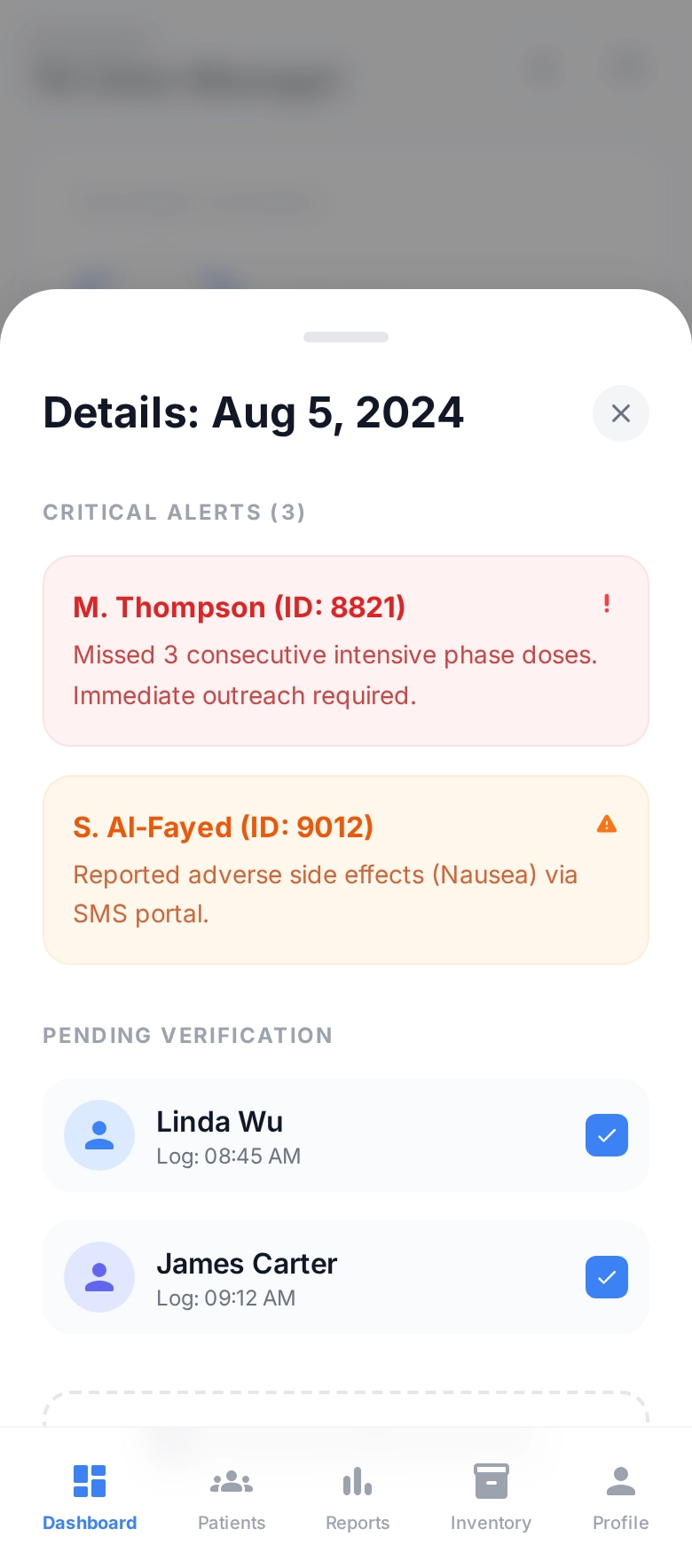
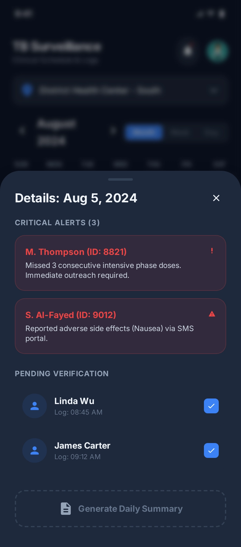
- Urgent information competed with routine monitoring. Alerts and pending verification needed to stand apart without making the whole interface feel alarm-driven.
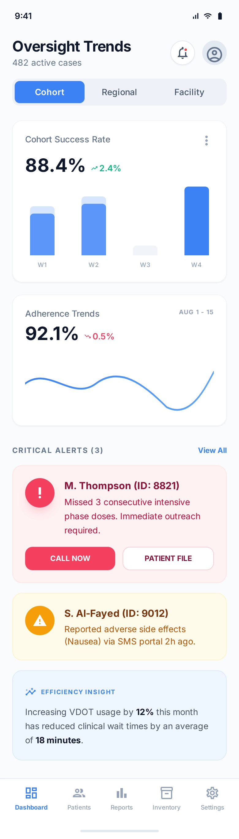
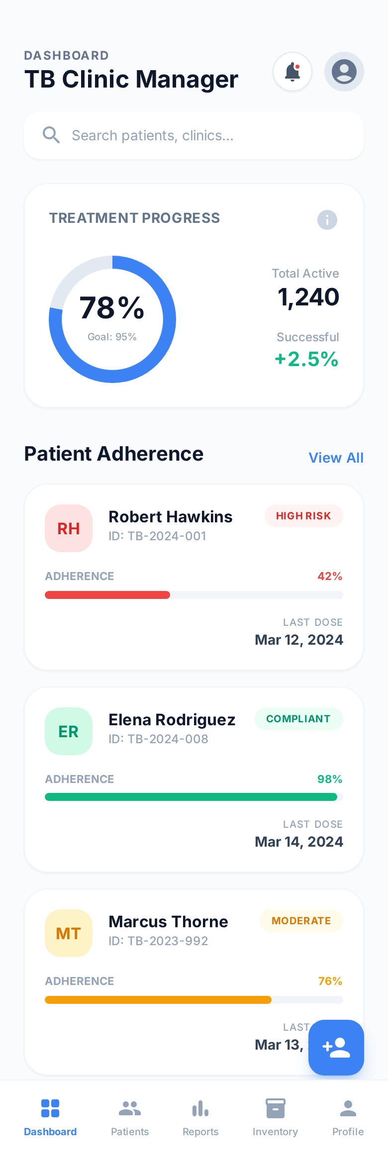
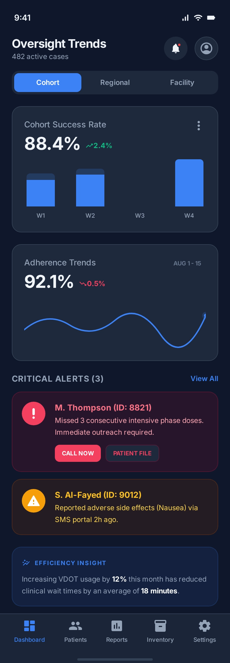
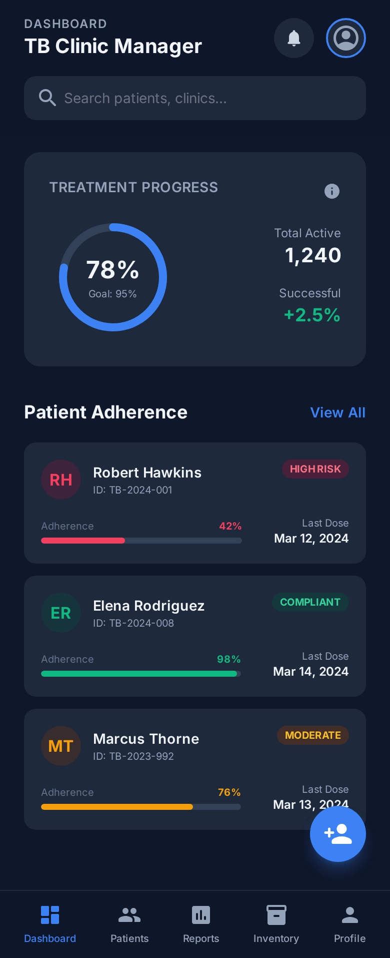
- Progress needed more than a status label. Adherence, last-dose timing and trends had to support quick understanding at different levels of detail.
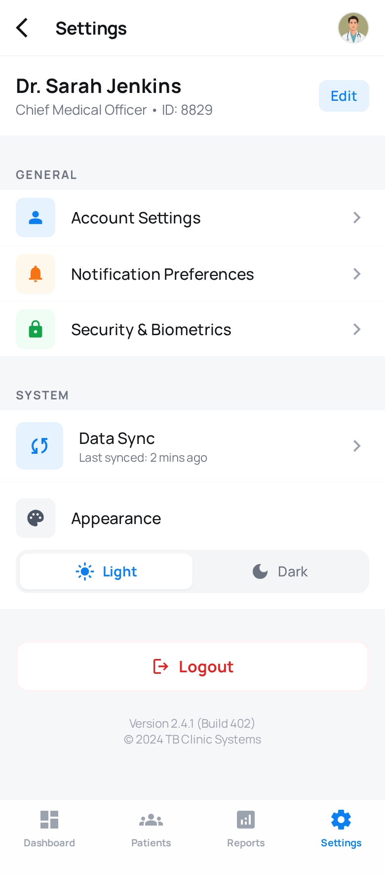
- Different screens still belonged to one operating model. Settings, alerts, treatment progress and oversight needed consistent patterns across devices.
The constraints I had to hold together
| Constraint | Why it mattered | Design response |
|---|---|---|
| Accessibility requirements | Core workflows needed to work for a broad range of users and meet WCAG expectations. | Make accessibility part of hierarchy, controls, contrast and validation throughout the redesign. |
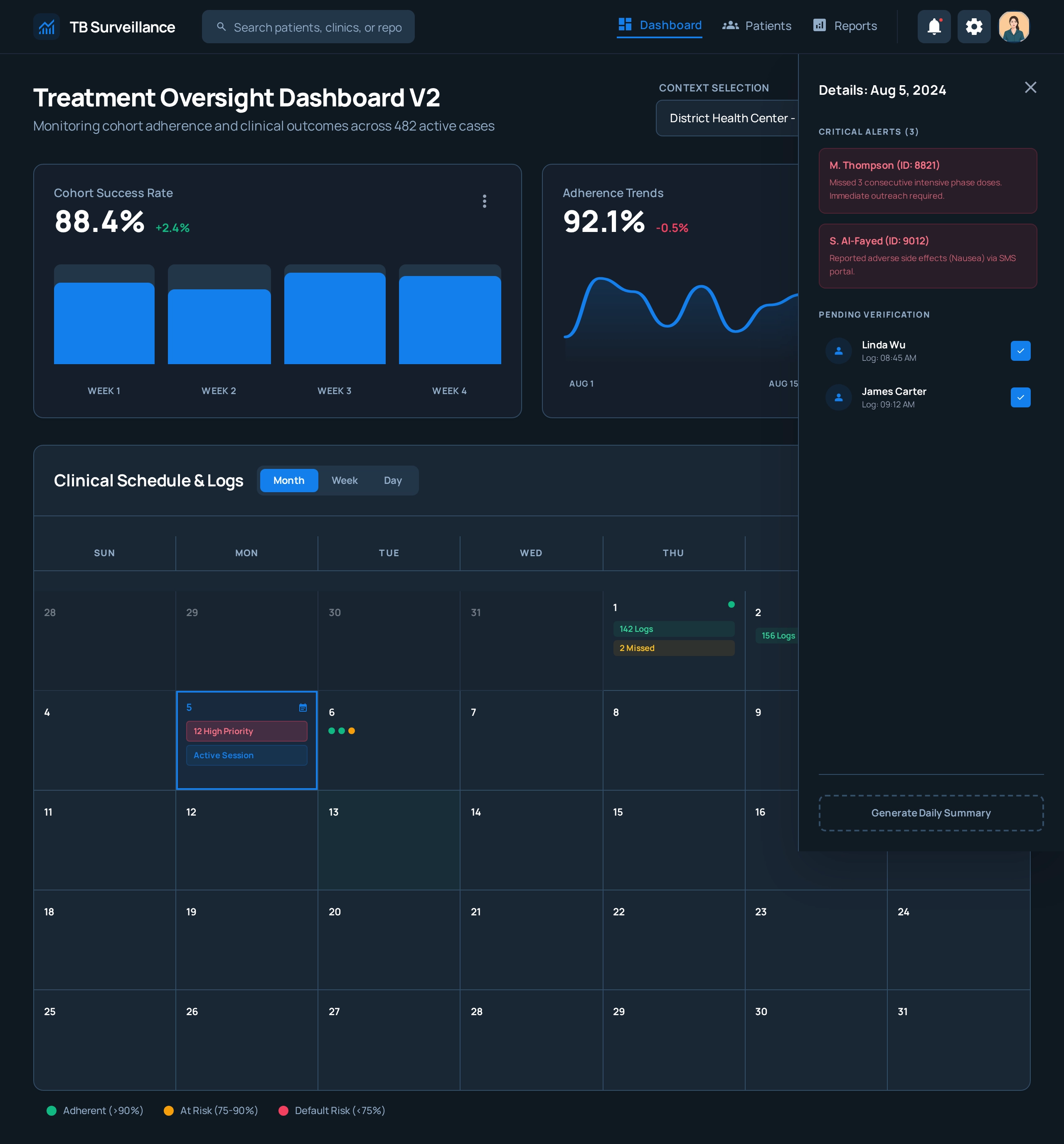
| Field and oversight contexts | Mobile use emphasised immediate action while desktop views supported broader monitoring. | Keep the same information model while adapting density and presentation to the task and device. |
| Critical versus routine information | Teams needed to notice urgent alerts without losing sight of ongoing treatment progress. | Use clear risk states, alert summaries and progressive detail rather than treating every item equally. |
| NDA-protected production work | Final production designs could not be shown publicly. | Use early-stage prototypes to demonstrate the interaction model and design reasoning without exposing protected material. |
The system I established
I organised the redesign around a small set of recurring decisions rather than isolated screens. The same interaction language connects account setup, urgent action, treatment progress and oversight.
- Configure
- Account, notification and security controls give people a predictable place to manage how the service behaves.
- Notice and verify
- Critical alerts and pending verification are surfaced with clear priority and accessible presentation.
- Track progress
- Treatment and adherence views combine status, timing and risk cues so field teams can understand what needs attention.
- Oversee
- Cohort metrics and trends support a wider operational view without disconnecting from the underlying treatment activity.
Accessibility shaped the interaction model
I designed and validated WCAG-compliant interfaces as part of the product work rather than treating accessibility as a checklist at the end. The prototypes use clear hierarchy, strong contrast, readable risk states and consistent controls across light and dark presentations.
The aim was not simply to make individual screens compliant. It was to reduce the effort required to identify status, understand what had changed and take the next action in a high-trust public-health workflow.
I worked across roadmap, design and validation
The engagement combined product direction with hands-on design. I worked with stakeholders to connect user needs and accessibility requirements to the roadmap, then translated that direction into prototypes and validated workflows.
- DiscoverWork with stakeholders to understand critical user needs, workflow problems and accessibility requirements.
- AlignConnect those findings to roadmap priorities and help teams make the redesign buildable and coherent.
- Design and validatePrototype accessible mobile and desktop experiences, test the workflows and refine the interaction model.
I also supported a user-first culture through strategic planning and mentorship, helping accessibility and usability remain shared concerns rather than design-only responsibilities.
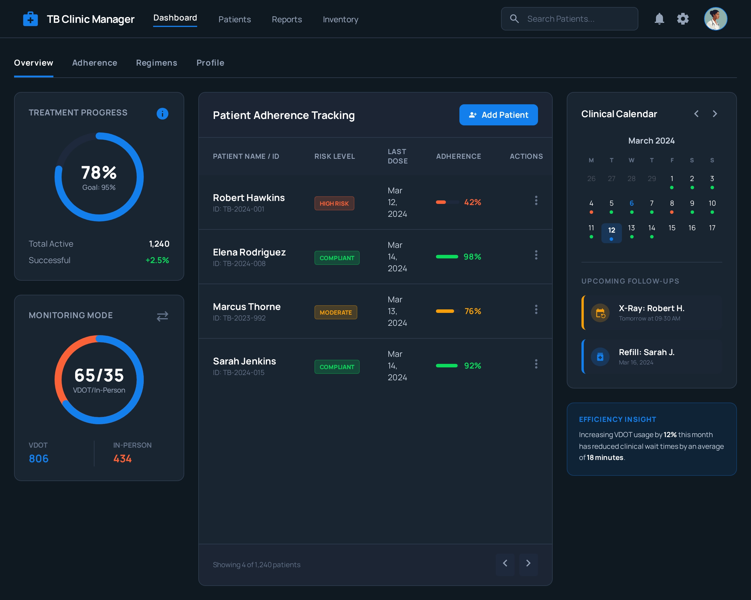
Evidence across contexts
Screens shown are early-stage prototypes. Final production designs are under strict NDA.
These additional prototypes show how the same system adapts across dark mode and denser desktop oversight without changing the underlying hierarchy of progress, alerts and follow-up work.
What changed
The redesign improved usability by 30% on key workflows and delivered WCAG-compliant experiences. The wider engagement also improved accessibility and adoption through workflow redesign and validation while strengthening collaboration between product, engineering and global-health stakeholders.
| Change | Outcome |
|---|---|
| Key workflows | 30% improvement in usability. |
| Accessibility | WCAG-compliant experiences embedded accessibility into the product rather than adding it after design. |
| Product direction | Discovery connected critical user needs and accessibility requirements to roadmap priorities. |
| Delivery culture | Closer collaboration across product, engineering and global-health stakeholders supported a more user-first approach. |